Best Photos for Color
This is an edited version of the original photos took of raspberries. This photo is used to represent monochromatic colors. It has different shades of red.
This is the original version of the photo I took in downtown Portland of the different colors of leaves in the fall. This photo gives a mood of the fall weather and the coziness and coldness of fall.
This is an edited version of the original photo showing complementary colors. The red complements the green and the purple complements the yellow. However the red goes very well with the yellow. All of the colors in the flower complement each other.
This is the edited version of the original photo. These are bushes of lavender that were being sold at the farmer's market. The photo represents cool colors. I edited the photo to make it seem both cool, but showing hints of warmth.
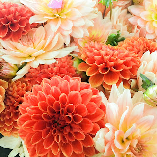
Last but not least, the flowers of this represent warm colors, but also monochromatic colors. These are different shades of red and pink. I took a close up photo on these flowers because I thought they were very pretty. This is also an edited version of the original photo.


Comments
Post a Comment